
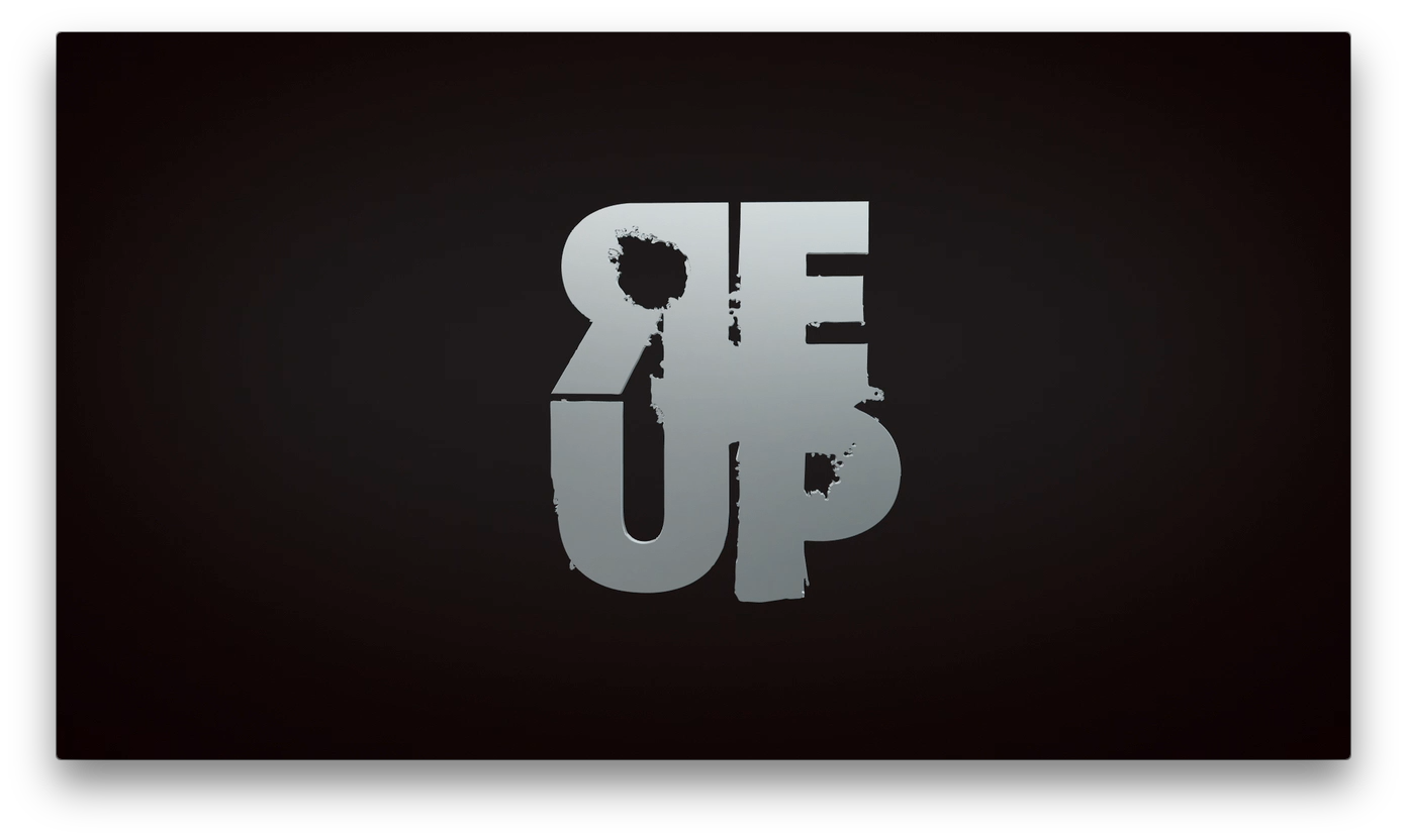
ReUp Logo Breakdown.
A story of love, redemption, and revenge. Brent Bartley, a highly-skilled gun-for-hire, who’s brought on as a private security operative with one responsibility, protect his client Kumari. Kumari’s Intelligence, beauty, and charm lead Brent to break the codes of client protection don’t make it personal.
Creative Director/Designer Ron Croudy of Smartbomb Creative Studios & Director: Setty McIntosh, breakdown the creative process behind the ReUp logo.
Q: What was your process behind the ReUp logo design?
Ron Croudy My process, is generally a review of the subject matter, theme, and style of the property/brand that the logo will represent. Then I develop visual or “sketch” concepts that could work and be presented to the client (in this case the director of the short). After a conceptual direction is selected, finalization is done.
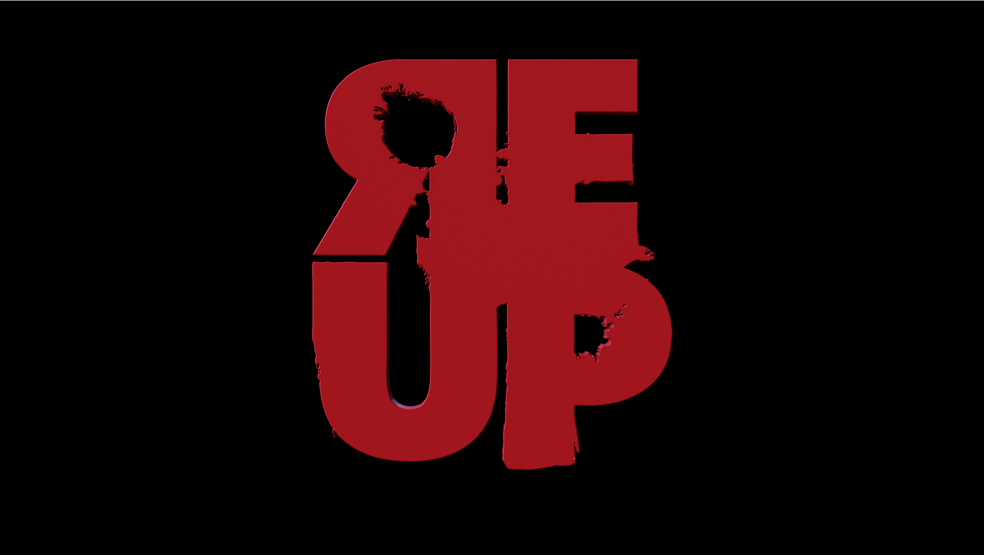
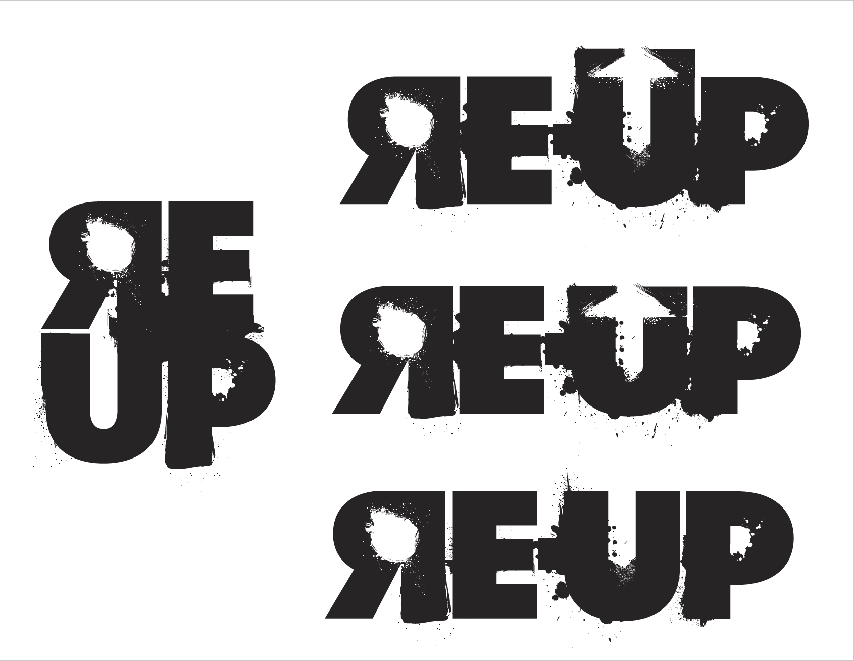
Q: The logo is full of texture, bullet holes, and frayed edges. It isn’t your standard clean and minimal design approach.
Ron Croudy: The property is a story of revenge with a sci-fi undertone within an urban approach. I wanted to find a way to show that visually in the title of the short. It is built to be a flat (non-3D) piece. However, the director added the 3D aspect to the finished template.
Some inspirational styles would be the “grunge” design style like that of RayGun Magazine created by David Carson as well as late 70’s to mid-80s sci-fi and horror movie titles and brands (ie; The Thing, The Terminator, Cannon Films, etc).
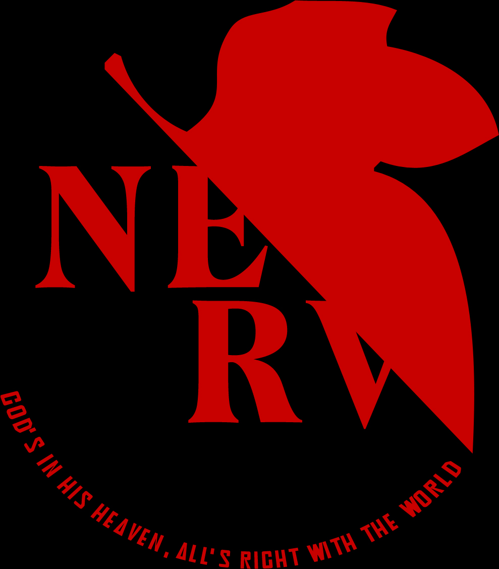
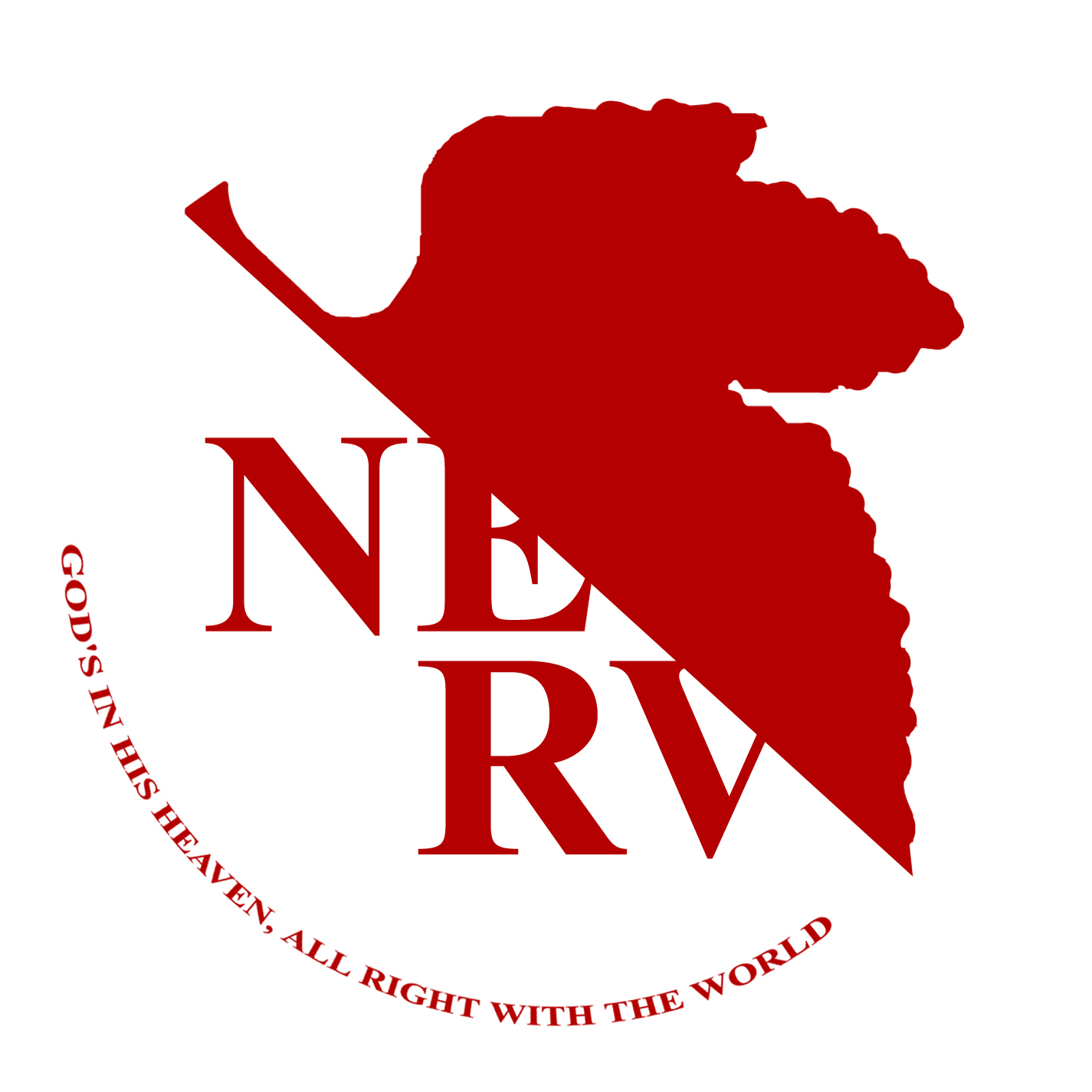
Setty McIntosh: At first glance, the logo reminded me of my favorite Anime Series, Production IG’s Evangelion, and its resemblance to the Nerv Logo.”
Setty McIntosh: The flat logo is perfect for the film’s overall aesthetic and branding, but introducing it to the public and setting the tone in a short amount of time was key. Animation with the film’s dialogue was the way to go.
Q: You and the director went over different versions. Why did you choose the final logo?
Ron Croudy: We wanted to visualize a sense of urgency and danger. The horizontal version of the logo did not seem to deliver that as well as the square version. The final version gives a “stamp” feel as well (ie; one of the ideas was that the story is based on a certain “top secret” project by the same name – imagine a file folder with the “re-up” stamp slapped on it but the file is old and worn).
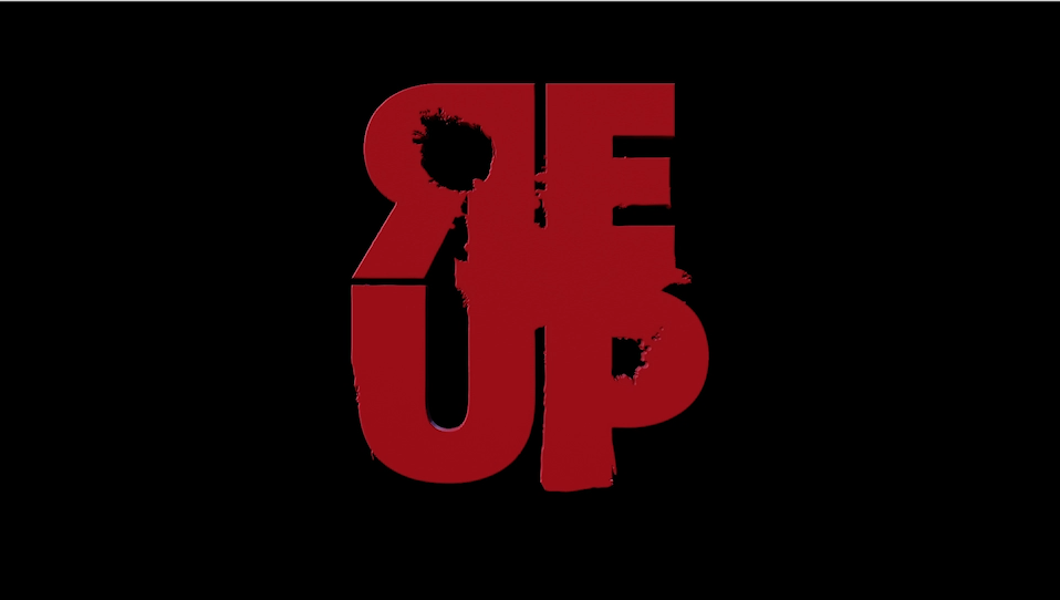
Q: The director decided on two color versions (metallic and red). In the end, why did he choose the red version to represent the IP?
Ron Croudy: That would be a question for the director. My thoughts are that Red is always a bold choice of color and follows the genre aesthetic, historically. As stated earlier, the logo is a template and could be used much like the “MTV” block logo and have various colors or textures replace the red (or work in unison) within reason.
Setty McIntosh the red logo embodies ReUp’s story of love, redemption, and revenge.
ReUp the film coming soon.